|
i like the star thing....
I HATE the colors...reminds me of my toys when I was like 4 years old...like 90's crap. |
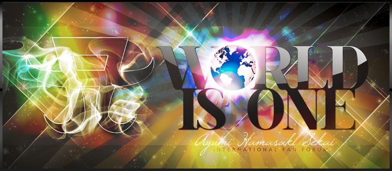
Cool, I like it. Now I want to see goods for Arena 2009 with this logo.
|
its too...retro for me
|
I like that she is doing the retro theme thoroughly.
|
Looks cool, although it could be more colorful =D
|
cute logo. i like the flashy colors :P
|
Haha thats cute! Its trulyretro but maybe a bit to much of the 90's. But its allright.^^
|
The logo's okay.... i like the previous ones better...
|
I like it.
|
I love it! it looks so new, not like previous classical
|
I actually quite like it. It isn't going to beat the original A or the My Story A, but it is pretty nice. I wasn't too fond of the 10th anniversary version; it was a bit "clunky" and heavy with too much going on. I bet this looks better when all black or one colour though
|
I like it!!!
Something new that matches with Rule/Sparkle and NEXT LEVEL covers perfectly!!!:love:love:love:love |
not the best but still good..i think it fits well with the theme that the next level cover brings us
|
I love it. She's really re-inventing herself.
It fits NEXT LEVEL perfectly :) |
|
I love it! SO pretty.. I hope there is lots of merchandise with this new logo!! :)
|
Quote:
thanks for the bigger version! |
Not as good as last years, but definitely better than Tour of Secret's Logo!
|
Quote:
|
LOLOLOLOLOLOL
That's really neat!!!.. XD... I like that... XD XD |
| All times are GMT +1. The time now is 05:48 AM. |
Powered by vBulletin® Version 3.8.4
Copyright ©2000 - 2026, Jelsoft Enterprises Ltd.