
|
| · Ayu's Official Site · Ayu's twitter · Ayu's YouTube · masa's translations · Misa-chan's translations · |
|
#161
 26th February 2010, 12:56 PM
|
||||
|
||||
|
Quote:
|
|
#162
26th February 2010, 02:27 PM
|
|||
|
|||
|
Add these gems to the list:
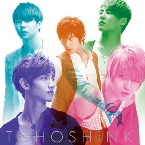  I still can't believe these are official. Ugh, it's like an amateur just went wild with the Hue/Saturation feature on Photoshop. And Micky's arm is like just randomly shooting out places in both. >_< These are the worst covers I think I've seen yet from DBSK. More proof that our boys need to get back together and do joint photoshoots instead of separate ones.
__________________
|
|
#163
26th February 2010, 03:13 PM
|
||||
|
||||
|
^ They're not that bad. I think the biggest problem with them is that single song is BALLAD. They don't suit to it at all

__________________
icon by rocket_girls at lj |
|
#164
26th February 2010, 03:30 PM
|
||||
|
||||
|
same thought with you tasking. I hate it when I like the song yet the single has like the worst cover from the artist... Toki wo Tomete for TVXQ and Sunrise for Ayu... ugh
__________________
YAYAYAYA GAGAGAGA DADADADA WOWOWOWO |
|
#165
26th February 2010, 04:20 PM
|
|||
|
|||
|
Well, at least Jaeho fans will be happy - Yunho's got his hands in Jaejoong's junk (see second cover) XD XD XD
__________________
|
|
#166
26th February 2010, 04:38 PM
|
||||
|
||||
|
^ LOL really xD I'm soo happy now xD
and their pose on the 1st cover is curious. ;>
__________________
icon by rocket_girls at lj |
|
#167
26th February 2010, 05:01 PM
|
||||
|
||||
|
lmfao I just looked at the covers again...
they're like the spamming of the colors on the COLORS single, and bad photoshopping in MIROTIC style... omg
__________________
YAYAYAYA GAGAGAGA DADADADA WOWOWOWO |
|
#168
26th February 2010, 06:04 PM
|
||||
|
||||

|
|
#170
27th February 2010, 02:54 AM
|
||||
|
||||
|
^well that's an ugly sweater to steal. he did your grandpa a favor and popularized it. not like we need a hideous thing like that to be popularized though. XD
__________________
Does everyone miss me yet? |
|
#171
27th February 2010, 03:46 AM
|
|||
|
|||
|
Quote:
She has such an odd look lol, Sometimes she's totally gorgeous, but her features are so prominent...when they dress her up too much she looks bad bad bad.
__________________
☆ bunnnniiiieeeesssss ☆ - The "New Artists You're Trying Out" Thread - |
|
#172
3rd March 2010, 04:46 PM
|
||||
|
||||
|
WHAT is she trying to go for? The awkward pose, the awful face, the skulls?

|
|
#175
3rd March 2010, 09:27 PM
|
||||
|
||||

__________________
Does everyone miss me yet? |
|
#176
3rd March 2010, 09:31 PM
|
||||
|
||||
|
^ I agree.
__________________
///crystal-castles\\\ |
|
#179
3rd March 2010, 11:46 PM
|
||||
|
||||
|
Quote:
FOREVER LOVE is GROSS. I love how Miliyah tries to be all fashionable and original and all that and most of the time she fails horribly, looking so cheap and tacky. Only cover I've ever liked of her was 20 -CRY- (that one was good) and Love Forever, which pwns FOREVER LOVE big time. Talking bout the Horse Lady...  Did they really thought we would believe she was there for real? Hello photoshop. And hello horrid yellow font and pants for making me have a seizure. Oh, and how ya doing, huge black roots? Someone needs to dye soon D: And lol at the adverts being blured out on PS XD SOO CHEAP. Tho the song is awesome and so is the video. |
 |
|
|
 |


 Linear Mode

