
|
| · Ayu's Official Site · Ayu's twitter · Ayu's YouTube · masa's translations · Misa-chan's translations · |
|
#162
 10th July 2015, 12:50 AM
|
||||
|
||||
|
Quote:

|
|
#163
10th July 2015, 12:55 AM
|
||||
|
||||
|
Quote:
__________________
|
|
#164
10th July 2015, 01:16 AM
|
||||
|
||||
|
Quote:
__________________
tumblr: pumpkinvision | 3DS friend code: 5386-7813-0796 | PSN: beatfreak19 
Last edited by orangeakira; 10th July 2015 at 01:24 AM.
|
|
#165
10th July 2015, 01:26 AM
|
||||
|
||||
|
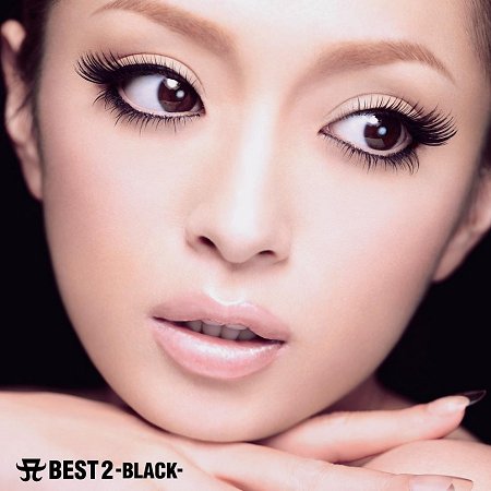
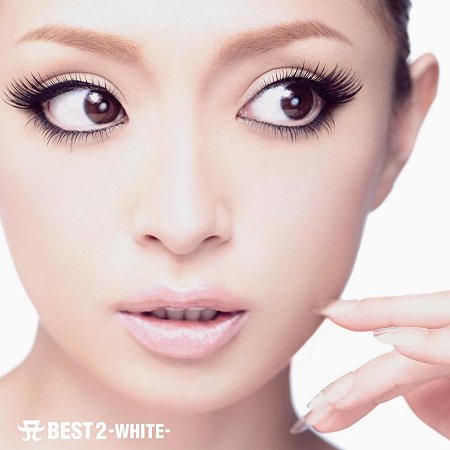
I don't see how ayu looks "sexualised" on these covers.
Quote:
classy. Six covers are awkward. Quote:
Quote:
They are not similar in the least, the "duck lips" in all of these pictures look natural and not too awkward like the six covers.
|
|
#166
10th July 2015, 01:34 AM
|
||||
|
||||
|
I'll be getting the CD only one~ I like it.
 Whenever I buy CD's I never look at their cover for more than a few seconds though. Whenever I buy CD's I never look at their cover for more than a few seconds though. That being said, I still tried to photoshop the duck/fish/sparrow lips to get an idea of what could've been.  
|
|
#167
10th July 2015, 01:46 AM
|
||||
|
||||
|
Another new set of photos, another bunch of unproductive whining about the fish lips ayu has done for a gazillion years lol
I think the fish lips themselves are a bit irritating but as long as she's not making big buggy stupid eyes I'm okay with them. The issue I have with the covers is that they use a wide angle lens. It makes it look like her eyes are too high up on a too-round head and like her nose is a big potato someone just stuck on there. I corrected it in photoshop to see if it makes them look any better and yes, yes it does.
__________________
Twitter: @deliriumzer0 Ayumi Hamasaki Song-A-Day 2015 (new ayu wiki site thing, work in progress, don't click yet)
|
|
#168
10th July 2015, 01:47 AM
|
||||
|
||||
|
^^CD+BD looks fine, but the other two look much more weird imo... I personally can't imagine the CD+DVD only with her mouth closed, I like it the way it is.
Quote:
__________________
|
|
#169
10th July 2015, 01:58 AM
|
||||
|
||||
|
Yes sorry I meant mouth shape.
But she also puts a lot tension in her mouth in some of the pictures. It's not a pucker, it's not natural. She's definitely pouting, and a pout is one step away from duck lips. She starting showing her bottom teeth around Guilty/A BEST 2?
__________________
"Remember, don't let others dictate your music taste. If you like whatever you're listening to, keep listening to it."
|
|
#171
10th July 2015, 02:08 AM
|
||||
|
||||
|
Ummm no you're not gonna remove my post that did not violate any rules. Grow up.
And watch this. Pay attention.
__________________
 教えてよねぇあなたならこの時代をどう生きる Ayu Concerts I've Attended: Arena Tour 2013: A BEST LIVE Arena Tour 2015: Cirque de Minuit Arena Tour 2016: MADE IN JAPAN You can find me on the gram: https://www.instagram.com/b_utifulfighter/
|
|
#172
10th July 2015, 02:08 AM
|
||||
|
||||
|
Quote:
|
|
#173
10th July 2015, 02:12 AM
|
||||
|
||||
|
Quote:
__________________
|
|
#174
10th July 2015, 02:12 AM
|
|||
|
|||
|
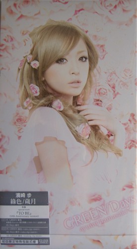
I don't think I was expecting such a "dark" theme for the covers, but I love the fact how they're more classy & dramatic for a mini-album, that's being released in the summer.
 Ayu is looking gorgeous in each of the covers! My favorite is the CD+DVD. Ayu is looking gorgeous in each of the covers! My favorite is the CD+DVD.  I really like the font, as well! I really like the font, as well!  Overall, I truly do love the covers. Overall, I truly do love the covers.
|
|
#175
10th July 2015, 02:23 AM
|
||||
|
||||
|
How can anyone deny the similarity between Ku's "Suki De..." covers and Ayu's covers for this album? Sure, their facial expressions are different, but the balance as far as where their body is placed, the slightly disheveled hair, the color (not that it's just black and white, but the exact same values of black and white saturation and contrast). They are so similar that if they were sitting side by side on a shelf, one could grab the wrong CD and not even realize it!
And this is not a matter of saying "SHE COPIED KUMI;" it's that people are so bullheaded that they can't even admit to someone making the observation that they look similar. ") A basic observation and people feel the need to make a fricking case about it. A basic observation and people feel the need to make a fricking case about it.And that's not even the real problem with these covers... As I said when they were first revealed, these covers make her look like she's trying really hard (to be Kim K), maybe not deliberately, but that's who they remind me of; these shots make her nose look particularly unflattering; and, her hair styling makes it appear as if the shoot was done in the salon chair, mid-cut. And the entire concept of "the real ayu" "the natural ayu" needs to be dropped ASAP! They've been hawking that shit for like 4 years now! Every shoot she does and every magazine piece she appears in tries to use this same concept! Last edited by Zeke.; 10th July 2015 at 02:31 AM.
|
|
#176
10th July 2015, 02:28 AM
|
||||
|
||||
|
Wow. Strong feels all around on these covers. Glad to see a mix of strong feelings, let's just cool it on attacking each other, thank you. I think everyone who loves and hates them have made great points.
These are far from flattering, almost lazy, especially when compared to A ONE; these are too similar to A ONE and that's my primary gripe. We just did the face close-up shots for covers, and I expected something not almost identical in style. That said, I am concerned, as my second point, that these covers will not be well received by Japanese fans and, as a result, sales will not be good at all. On the plus side, positively unique among her history of covers. These are a very different feel, more original than A ONE, much more natural. Overall, I think the font fits the style, a nice detail that again following A ONE, proves that there is at least better consistency in the art style and typography. Now, my opinion: Bad. My first reaction, when I saw them on Facebook, was, "Are you fucking serious, Ayu?" Brusque, short, nothing like my reaction to PQ covers (I will always harp on Ayu for the bawdiness of PQ, and especially for making a photo of her, leaning her head on a shoe, a cover.) Her mouth looks unnatural, like she has a major overbite and talks through her nasal cavity, or even might have a bad lisp. The photos look messy, like they were shot with a webcam, and after she woke from a nap, and while she has a cold. Again, they are original mood, style, but too similar to A ONE. I will probably replace them with a fan cover. I don't think these should have turned out this bad. But they just come off sloppy, disorganized, and blatant, also lazy due to those similarities with A ONE covers. She has, however, managed to be consistent with these covers, her third in a row without major typography awkwardness or other clear design inconsistencies.
__________________
 -> <- -> <-
|
|
#177
10th July 2015, 02:32 AM
|
||||
|
||||
|
The inner booklet stuff should be good if it's in the vein of things that would be published in Numero.
Japanese fans seem to like them since she looks 'cute' to them and detractors obviously have their issues with them as they usually do seem to find issue with just about anything Ayu does. This is probably the most Japanese she has looked on a recent cover IMO.
__________________
|
|
#178
10th July 2015, 02:40 AM
|
|||
|
|||
|
Quote:
That said, the more I look at the CD+Bluray, the more I'm like...how the fuck could anyone think this is an acceptable cover??? You're telling me there weren't better options from the rest of the shoot. Oy frikin vey.
|
|
#179
10th July 2015, 02:45 AM
|
||||
|
||||
|
^ and the first world problem part is that now I collect cd Blu Ray editions because I can't handle lower quality anymore yet that cover is the worst for me. I actually like the cd + DVD edition but that dvd quality tho. If I were crazy I'd by both and just switch the covers but we don't live in a perfect world
|
|
#180
10th July 2015, 02:47 AM
|
||||
|
||||
|
It's funny reading impressions since everyone seems to have different covers that they favor or loathe. CD only or CD+BD seem to be getting the most mixed reactions.
__________________
|
 |
| Tags |
| 浜崎 あゆみ, 浜崎あゆみ, sixxxxxx |
|
|
 |


 Linear Mode

