
|
| · Ayu's Official Site · Ayu's twitter · Ayu's YouTube · masa's translations · Misa-chan's translations · |
|
#41
 14th November 2007, 12:46 PM
|
||||
|
||||
|
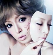
Beautiful cover! I love it.

|
|
#42
14th November 2007, 12:47 PM
|
|||
|
|||
|
This would be an amazing and perfect cover if it weren't for the stupid thing on her head :/
*sigh* Her face looks really beautiful in this shot, it's a shame the headgear ruined it for me :/ And why is this not a damn physical release? =/ gr Thanks for posting.
|
|
#43
14th November 2007, 12:51 PM
|
||||
|
||||
|
thanks, i love u :x
__________________
My P(A)ges: https://www.facebook.com/ayuvietnam/ https://www.facebook.com/KodaKumiVietnam/ https://www.facebook.com/AyuJpopFansub/
|
|
#44
14th November 2007, 01:35 PM
|
||||
|
||||
|
Gorgeous cover. Crappy text.
|
|
#45
14th November 2007, 01:38 PM
|
||||
|
||||
|
It'd be better textless, but for a digital release, I guess it was necessary. Still, it could've been less tacky looking.
Not great, but not disappointing. From a distance, her right eye (or left if it were flipped) looks really odd.
|
|
#47
14th November 2007, 01:50 PM
|
||||
|
||||
|
Awesome~! It may be a single like No way to say. Hope so!!
__________________
|
|
#50
14th November 2007, 02:07 PM
|
||||
|
||||
|
Now THAT's beautiful. Thanks! <33
__________________
|
|
#51
14th November 2007, 02:09 PM
|
|||
|
|||
|
Oh, that's a pretty cover. Much better than t2m I would say, much better!
This will sell millions 
__________________
We chase misprinted lies We face the path of time And yet I fight This battle all alone No one to cry to No place to call home
|
|
#53
14th November 2007, 02:27 PM
|
||||
|
||||
|
Quote:
for a cover? lol 
__________________
|
|
#57
14th November 2007, 03:08 PM
|
||||
|
||||
|
I like the thing on her head. It gives a more unique and different look than if she only had her hair.
Quote:
__________________
Girls' Generation is ♥.
|
|
#58
14th November 2007, 03:09 PM
|
||||
|
||||
|
Sweety and calm
Want this cover for a real single
|
|
#60
14th November 2007, 03:35 PM
|
||||
|
||||
|
^ I think that looks too bland and disproportionate. I like the original version. It's nice for a ballad single.
__________________
Last edited by Raleigh; 14th November 2007 at 03:37 PM.
|
 |
|
|
 |


 BEST Initiate


 Initiate


 Linear Mode

