
|
| · Ayu's Official Site · Ayu's twitter · Ayu's YouTube · masa's translations · Misa-chan's translations · |
|
|
|
#1
 5th April 2024, 11:09 AM
|
||||
|
||||
|
The coreography in the Sneakpeek is so cool. Im looking forward for the full version!

|
|
#2
5th April 2024, 11:43 AM
|
||||
|
||||
|
__________________
 LIVE: TV VERSIONS | all a-nation performances | A -Vocal tracks- a-nation audio rips | AYUMI ALL SCANS TEXTLESS | 25th Anniversary Museum ~A WORLD IS ONE~
|
|
#3
5th April 2024, 12:53 PM
|
||||
|
||||
|
Love this sneak peak !!!
__________________
 My Ayu's page Facebook - Ayu Paradise|My Instagram|My [Books] Blog Set made by Me
|
|
#4
5th April 2024, 01:24 PM
|
||||
|
||||
|
loved the usage of sign language
 hahahaha she looks so idol-ish with the outfit, pv concept, and even the song itself reminds me of idol groups, i hope at least it helps the song to perform better than Jidai on digital charts (and pls, dont make this a japan exclusive release) hahahaha she looks so idol-ish with the outfit, pv concept, and even the song itself reminds me of idol groups, i hope at least it helps the song to perform better than Jidai on digital charts (and pls, dont make this a japan exclusive release)
__________________

|
|
#9
6th April 2024, 02:22 AM
|
||||
|
||||
|
I was like... where have I seen this concept of chairs but better executed... and then I remember:
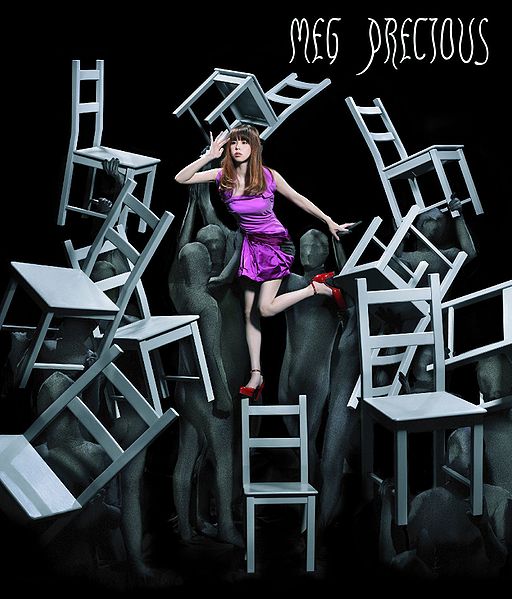  Ayu's looks like a scene from Batte Royale.
__________________
I'm back! as of 2018.09.16  Spoiler:
Last edited by minkAYuko; 6th April 2024 at 02:26 AM.
|
|
#10
6th April 2024, 01:00 PM
|
||||
|
||||
|
Quote:
The concept is not really the same. This is more theater and Alu is just simple graduation/shool-whatever as there are school kids in the video and the song obviously speaks to a younger audience. As for the font discussion: I think fancy fonts are the worst thing on CDs and other media. They are 90% miss and rarely add anything. The only time this passes for me is, if there is a consistent font choice (like for Manga-series and s so on; Mika Nakashima also does a really great job at it and it always bothers me if they don't decide to do it at all- in rare occasions) and not jumping from one cover to the other. Aye had this with her A and they should have simply build around it for her whole career, keeping it simple. That said, a simple white font aesthetically is the most fitting they did in the last few years.
__________________
awsome SET made by Foxxy_Fuyumi l ~**My HQ-MV CAP COLLECTION THRAD**~ l ~**My HQ-Audio Live Rip COLLECTION THRAD**~
|
|
#11
6th April 2024, 08:33 PM
|
||||
|
||||
|
Quote:
...and i rly didnt get the vibe of this song  supposedly i'm not the targeted audience supposedly i'm not the targeted audience 
__________________
Last edited by brener; 6th April 2024 at 08:37 PM.
|
|
#12
7th April 2024, 10:31 AM
|
|||
|
|||
|
Quote:
As a person who started the topic I should clarify more. The problem is not just a font but the whole desicion of typography. The position of title (to put in the lower right angle) / the thiness / the color / the vertically scale Ayu has a lot of CD cover which feature normal fonts like NEVER EVER, STEP you/is this LOVE? but the boldness of alphabet, the color that goes well with background or color scheme, or the position of the title - it makes the cover looks simply good and outstanding without to be fancy. Even MADE IN JAPAN that looks like a watermark on a licensed photo, it's still good because they put the title in the center of the picture.
|
|
#13
7th April 2024, 10:57 AM
|
||||
|
||||
|
Quote:
but see, I really like how it looks and where it is positioned. I dislike font that goes across the picture or is placed somewhere in the middle (23rd Monster, A Ballads 2). And looking at the current example, the font checks everything I like. It has a good position, it is alldingend, it looks simple and every other placement would have been to playful for me ( I could see it on the bottom in the middle tho). The only thing that bothers me that they are switching up the font and size every time. edi: STEP you is a good example of why a font should be simple and white. It hurts the eyes, it is barely readable and for me it is too big (yet it works cause it looks like a glamour shot)
__________________
awsome SET made by Foxxy_Fuyumi l ~**My HQ-MV CAP COLLECTION THRAD**~ l ~**My HQ-Audio Live Rip COLLECTION THRAD**~
|
|
#14
6th April 2024, 09:22 AM
|
||||
|
||||
|
【滨崎步】浜崎あゆみ・新曲『BYE-BYE』NHK Ver. 先行试听~みんなのうた~
https://www.bilibili.com/video/BV1VZ..._more_video.-1
__________________
|
|
#15
7th April 2024, 07:50 AM
|
||||
|
||||
|
Quote:
__________________
My Ayu's page Facebook - Ayu Paradise|My Instagram|My [Books] Blog Set made by Me
|
|
#16
6th April 2024, 02:43 PM
|
||||
|
||||
|
The cover is really pretty! I like the song as well, can't wait for release day. It's interesting that she's doing this style (sound) now as she never did it originally in the late 90s / early 2000s. But it's nice to hear something different from her.
|
|
#17
7th April 2024, 08:53 AM
|
||||
|
||||
|
This song got ourselves vibe
|
|
#18
7th April 2024, 04:07 PM
|
||||
|
||||
|
__________________
LIVE: TV VERSIONS | all a-nation performances | A -Vocal tracks- a-nation audio rips | AYUMI ALL SCANS TEXTLESS | 25th Anniversary Museum ~A WORLD IS ONE~
|
|
#19
7th April 2024, 04:16 PM
|
||||
|
||||
|
Her face really bothers me in this new PV... She kinda looked normal again last year, and now it's almost scary ��
The song is good though, catchy and refreshing! If she drops an album in the same direction, it should be a good one!!
__________________
~ since 2005 ~
|
|
#20
7th April 2024, 04:32 PM
|
||||
|
||||
|
Quote:
 I loved the final part of the song! P.S. I lowkey was expecting a mini/album announcement today.
|
 |
|
|
 |


 Initiate

 Initiate


 Hybrid Mode
